Baron Grid
A risk engineering platform for utility-scale solar and battery storage, sold to insurers and engineers who read specifications for a living. The site had to earn credibility with a technical audience before it asked for anything.
- Client
- Baron Grid
- Industry
- Renewable Energy Risk Engineering
- Location
- Tulsa, Oklahoma
- Year
- 2026
- Scope
- Website Strategy
- Custom Web Design
- Development
- Product Presentation
- Content Organization
- Responsive Design
Launching 2026
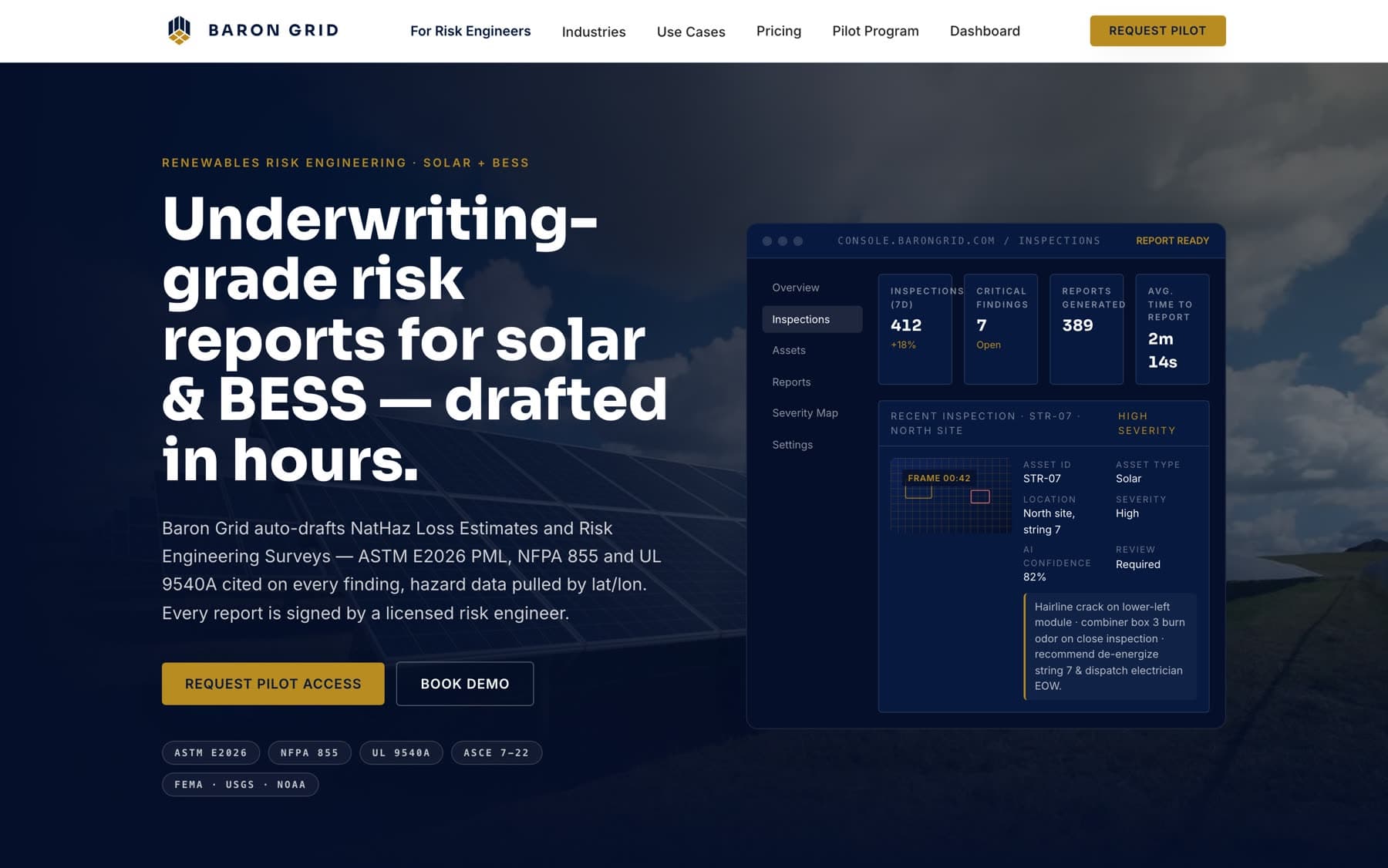
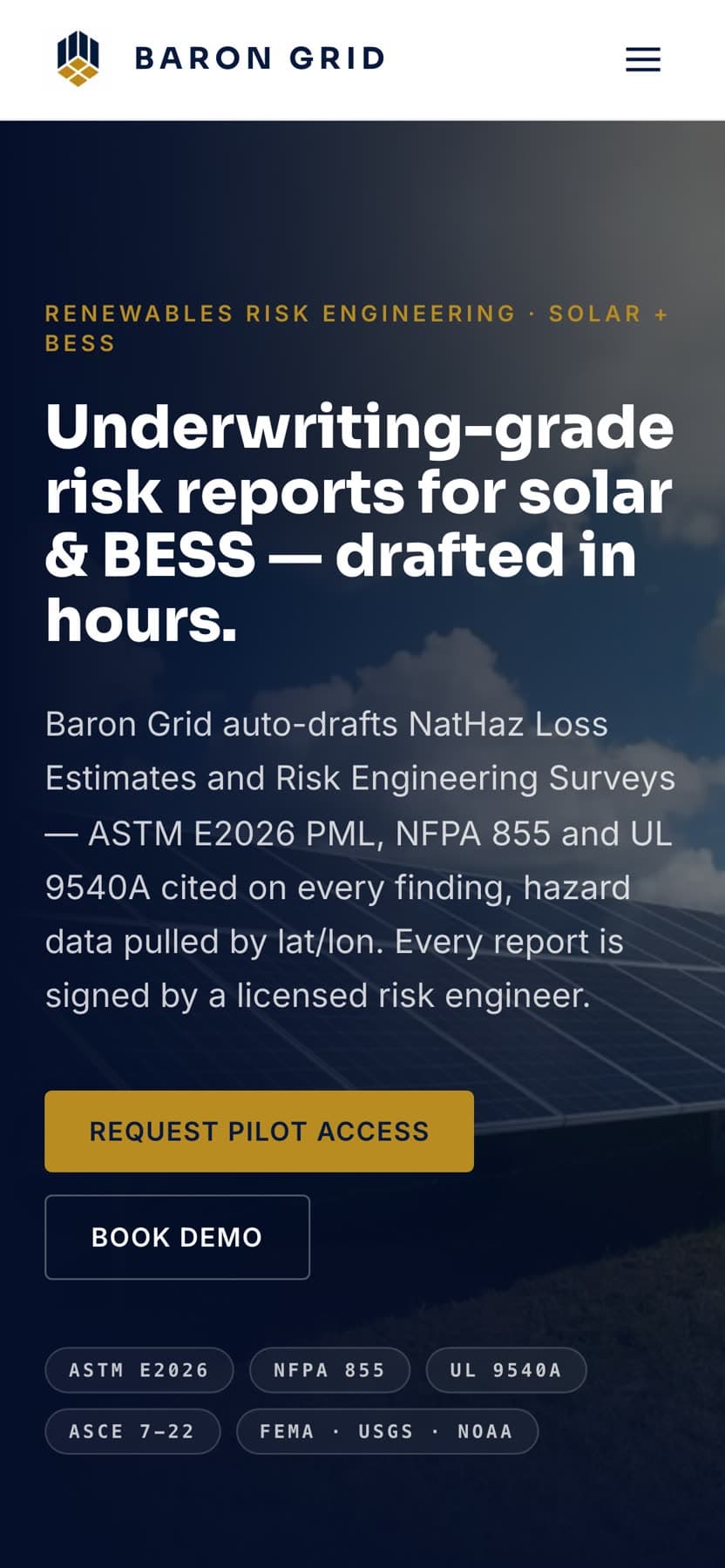
Homepage, desktop and mobile
Overview
What the project needed to do.
Baron Grid drafts natural-hazard loss estimates and risk engineering surveys for utility-scale solar and battery storage sites. Its buyers are reinsurers, underwriters, risk engineers, and asset owners, people who will not be persuaded by adjectives.
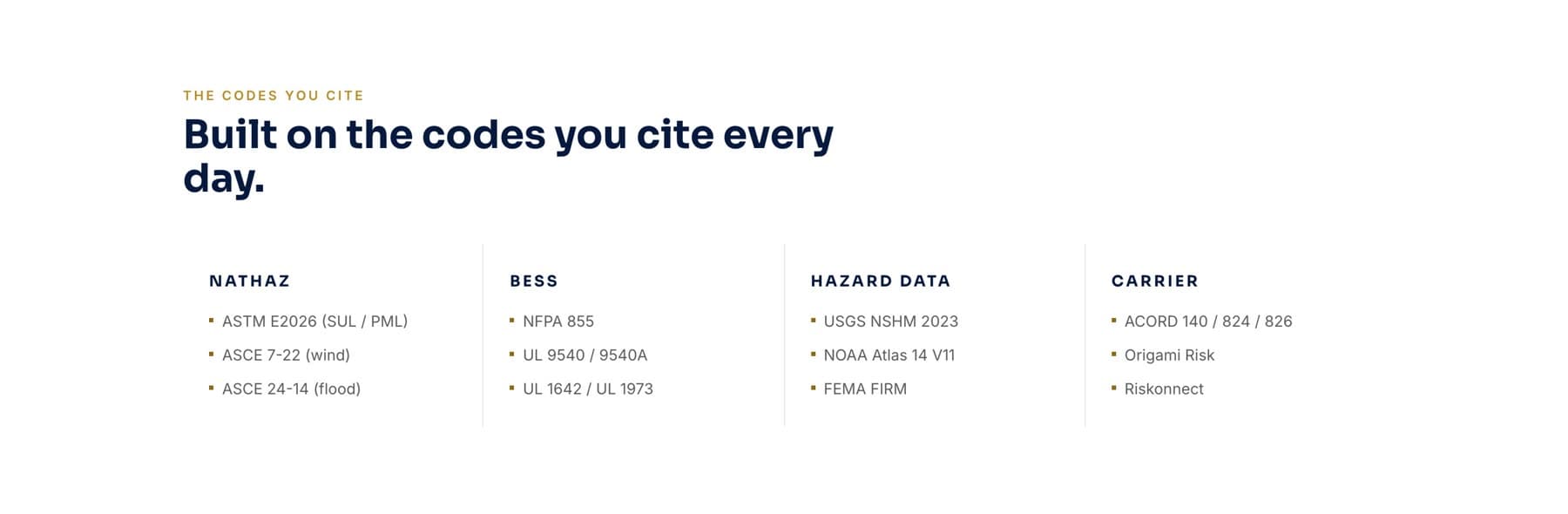
The website's job was to demonstrate the product rather than describe it, and to speak in the vocabulary the audience already uses: ASTM E2026, NFPA 855, UL 9540A, ASCE 7-22.
The problem
Technical products aimed at conservative industries have a credibility problem in both directions. Too much polish reads as a startup that has never seen a substation. Too little reads as a prototype nobody should underwrite with.
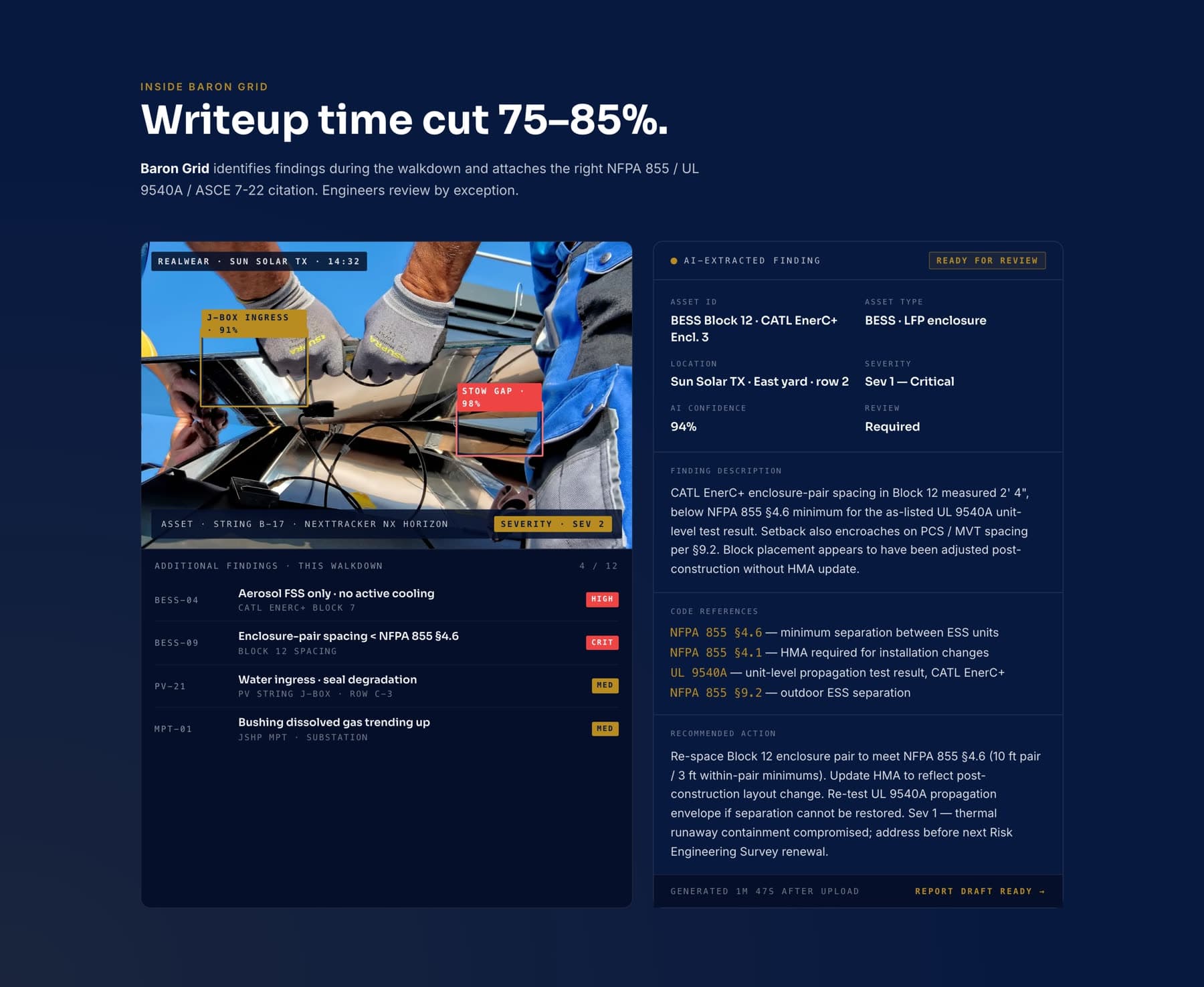
The audience also does not browse. A risk engineer evaluating a tool wants to see the actual output (a finding, its citation, its severity, its recommended action) not a features list.
The site therefore had to put real product surface on the page early, and be precise enough that a specialist reading closely would not find a wrong reference.
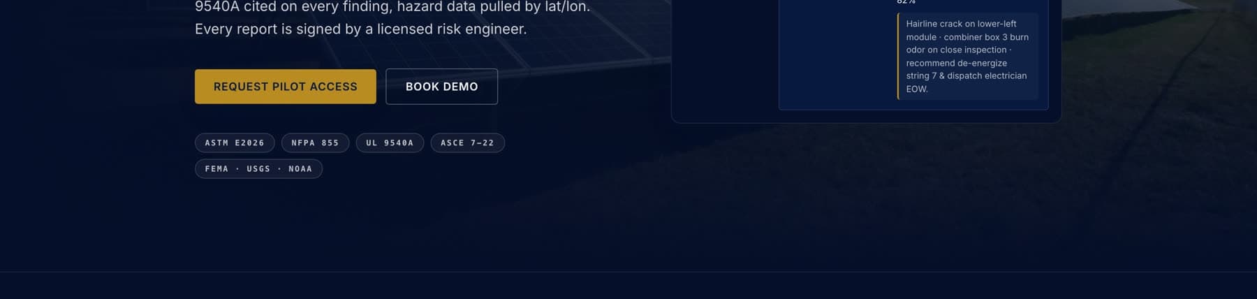
A deep navy field with a single warm gold accent, set in a tight geometric sans. The restraint is deliberate: one accent color, one type family, and a strict grid make the technical content the loudest thing on the page.
From the Baron Grid website
Design
Design direction
- Palette
- Deep navy, warm gold, cool white
- Display type
- Tight geometric sans, set heavy
- Detail type
- Monospace for identifiers and citations
- Imagery
- Product console views and site photography
A deep navy field with a single warm gold accent, set in a tight geometric sans. The restraint is deliberate: one accent color, one type family, and a strict grid make the technical content the loudest thing on the page.
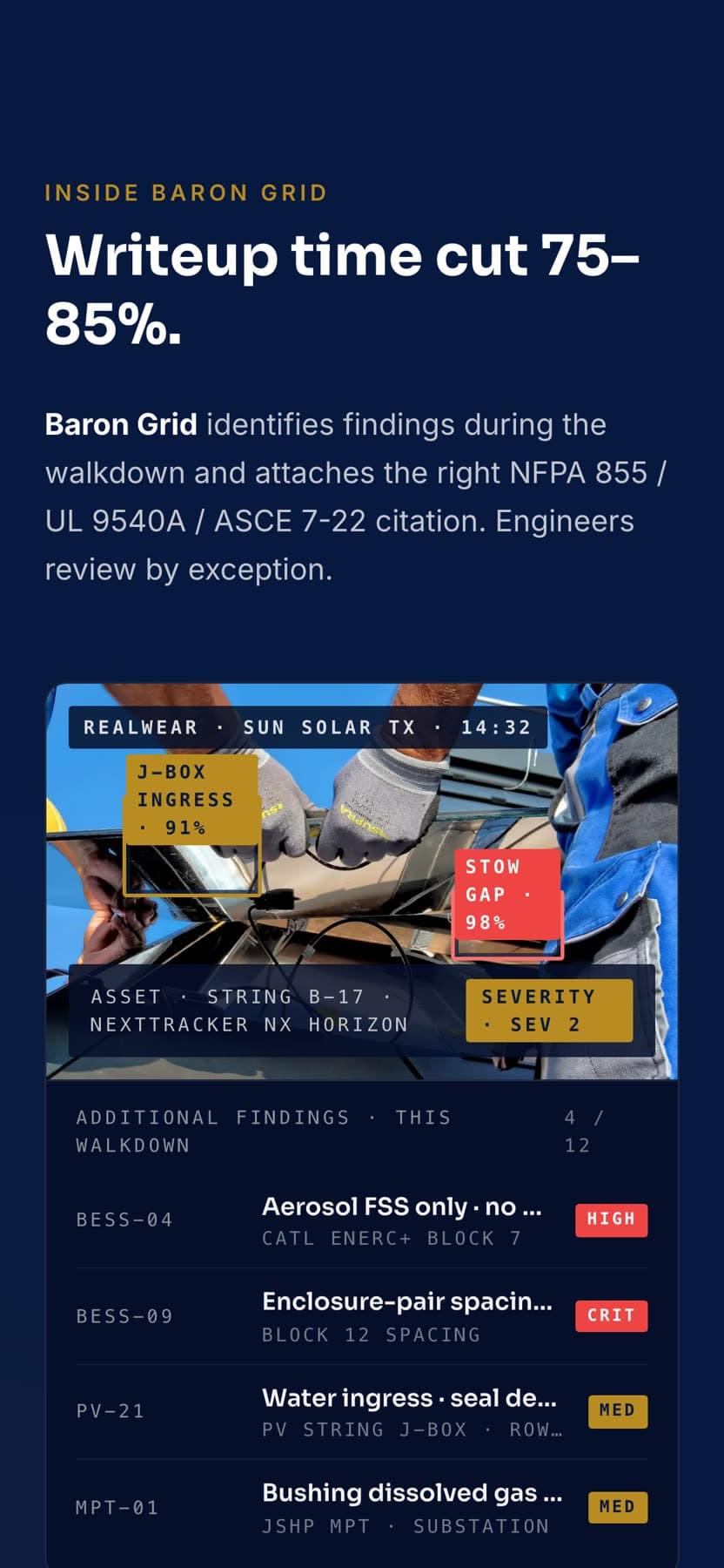
Product surfaces are rendered as full console views rather than decorative fragments, the inspection list, a specific finding with its severity and confidence, the code references, the recommended action. They read as screenshots of a working tool because they are shaped like one.
Standards and data sources are set as small, precise labels near the claims they support, which is how the audience expects citations to behave.
Content
Content hierarchy
The page leads with the specific claim (underwriting-grade reports drafted in hours) then immediately names the standards behind it, so the promise and its evidence sit together.
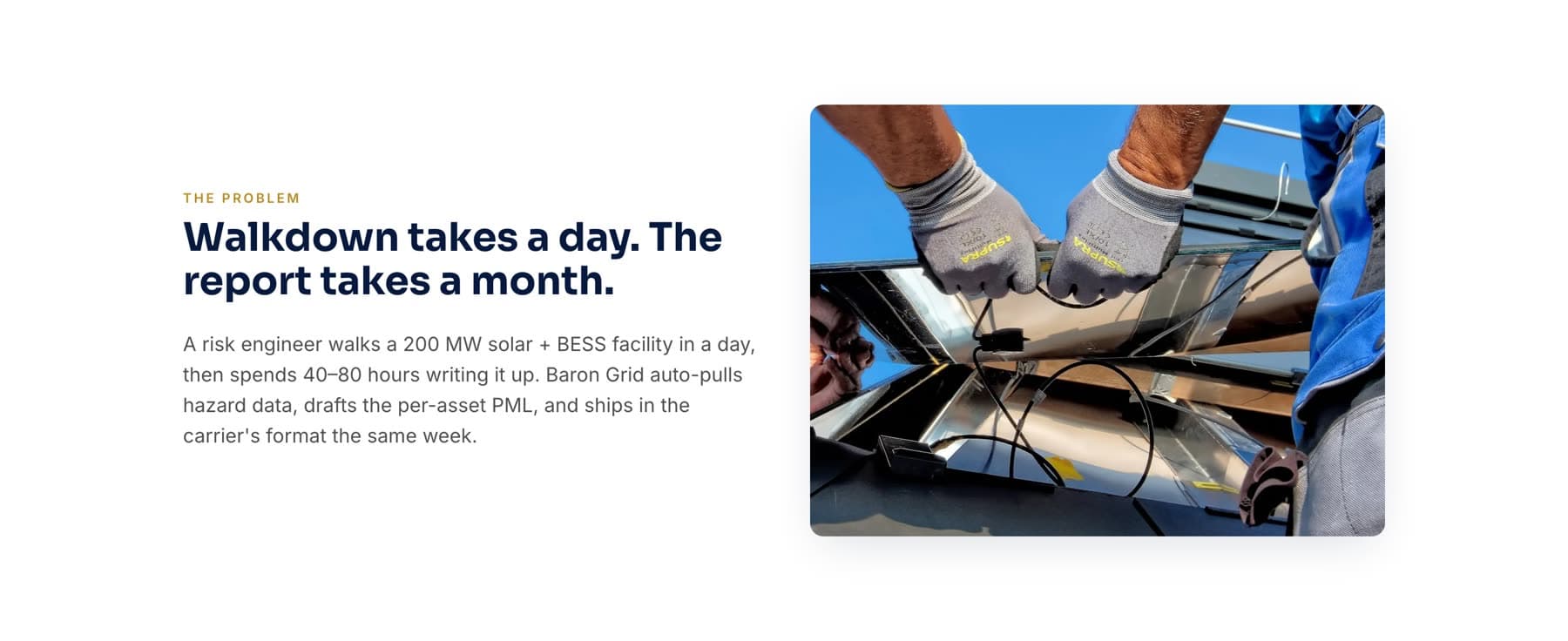
The problem is stated in the audience's own terms: a walkdown takes a day, the write-up takes a month. The product sections then map directly onto that gap.
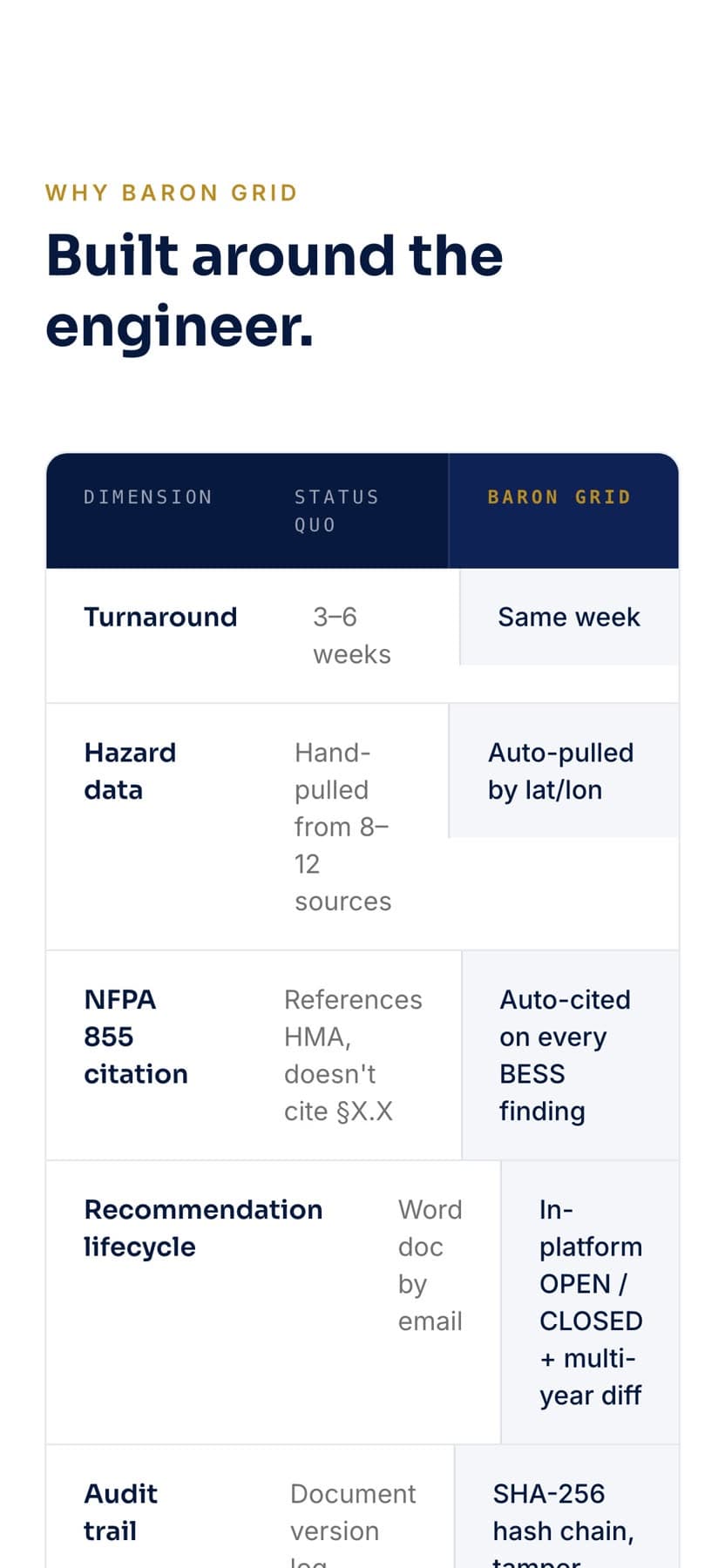
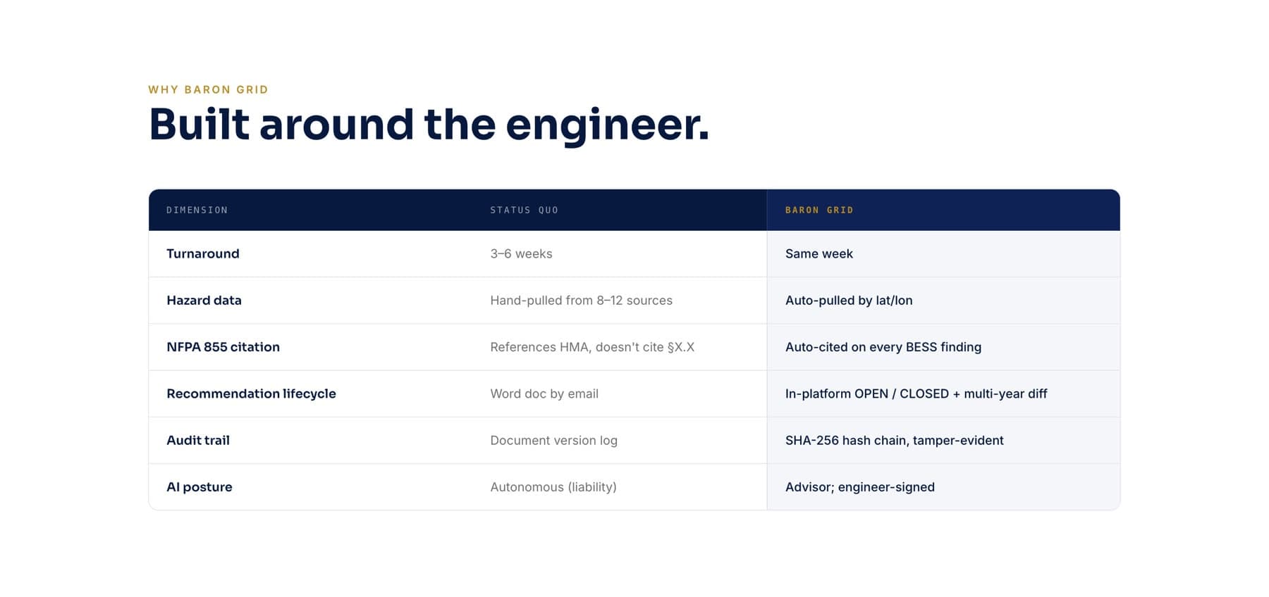
Comparison is handled as a plain dimension-by-dimension table rather than a persuasion device, and pricing is stated openly at the foot of the page instead of hidden behind a form.
- 01The claim: what the platform produces and how fast
- 02The standards: the codes and data sources behind every finding
- 03The problem: where engineering time actually goes
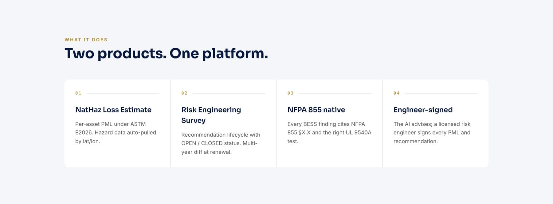
- 04The products: loss estimates and risk engineering surveys
- 05Inside the tool: a real finding, cited and severity-rated
- 06Comparison and pricing: stated plainly
Mobile
Mobile experience
Dense product views are the hard part of this layout on a phone. Rather than shrinking a console screenshot until its text is unreadable, the mobile layout reconstructs the same information as native stacked blocks (finding, severity, citation, action) at full legibility.
The standards labels wrap into a two-column grid, and the comparison table becomes a sequence of labelled pairs instead of scrolling sideways.
The headline re-sets to a smaller optical size so the primary claim still holds the first screen.
Gallery
Selected pages.
Not yet public.
Baron Grid is finished and preparing to launch. A public link will be added here once the site is live at its own domain.
Want work like this for your business?
Every project starts with a conversation about what the business does and who it is trying to reach.