Fairway Freight
A door-to-door golf club shipping service that needed to look like a premium travel brand and behave like a booking tool. Quoting, tracking, destination content, and support were brought into one site.
- Client
- Fairway Freight
- Industry
- Golf Travel and Logistics
- Location
- Tulsa, Oklahoma
- Year
- 2025
- Scope
- Website Strategy
- Custom Web Design
- Development
- Booking and Quote Experience
- Content Organization
- Responsive Design
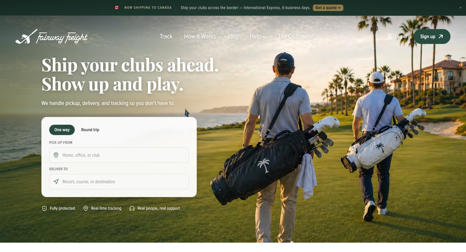
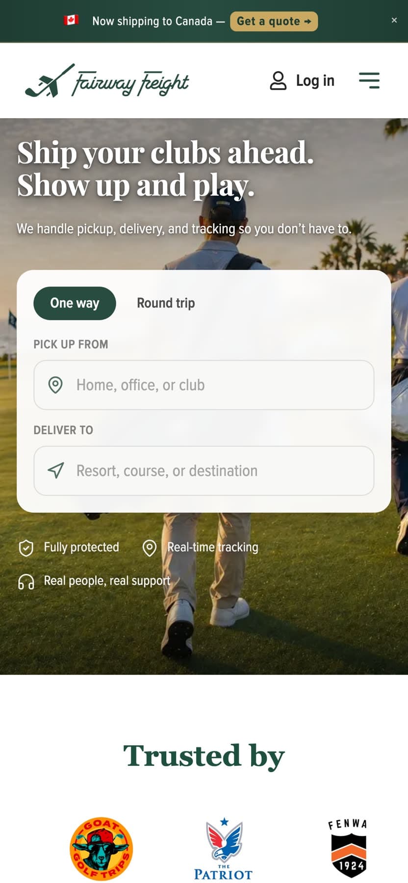
Homepage, desktop and mobile
Overview
What the project needed to do.
Fairway Freight ships golf clubs ahead of the golfer, picked up at a home or office, delivered to a resort or pro shop. The business competes with the airline baggage counter, so the website has to do two jobs at once: make the alternative feel obviously better, and let someone start a shipment in about a minute.
The project covered the marketing site, the quote and booking entry point, destination content for the courses golfers actually travel to, and the supporting help and tracking pages.
The problem
Shipping is a category people associate with carrier websites, dense forms, tracking numbers, and interfaces designed for a warehouse. Golf travel is the opposite: aspirational, photographic, and tied to places people look forward to.
The site needed to hold both at once. Lead with the trip, not the freight, then hand over to a booking flow that is fast and unambiguous.
A second constraint was reach. Golfers search by destination (Pebble Beach, Bandon Dunes, Pinehurst) so the site needed real content for each of those places rather than one generic services page, without turning into a farm of thin, repetitive pages.
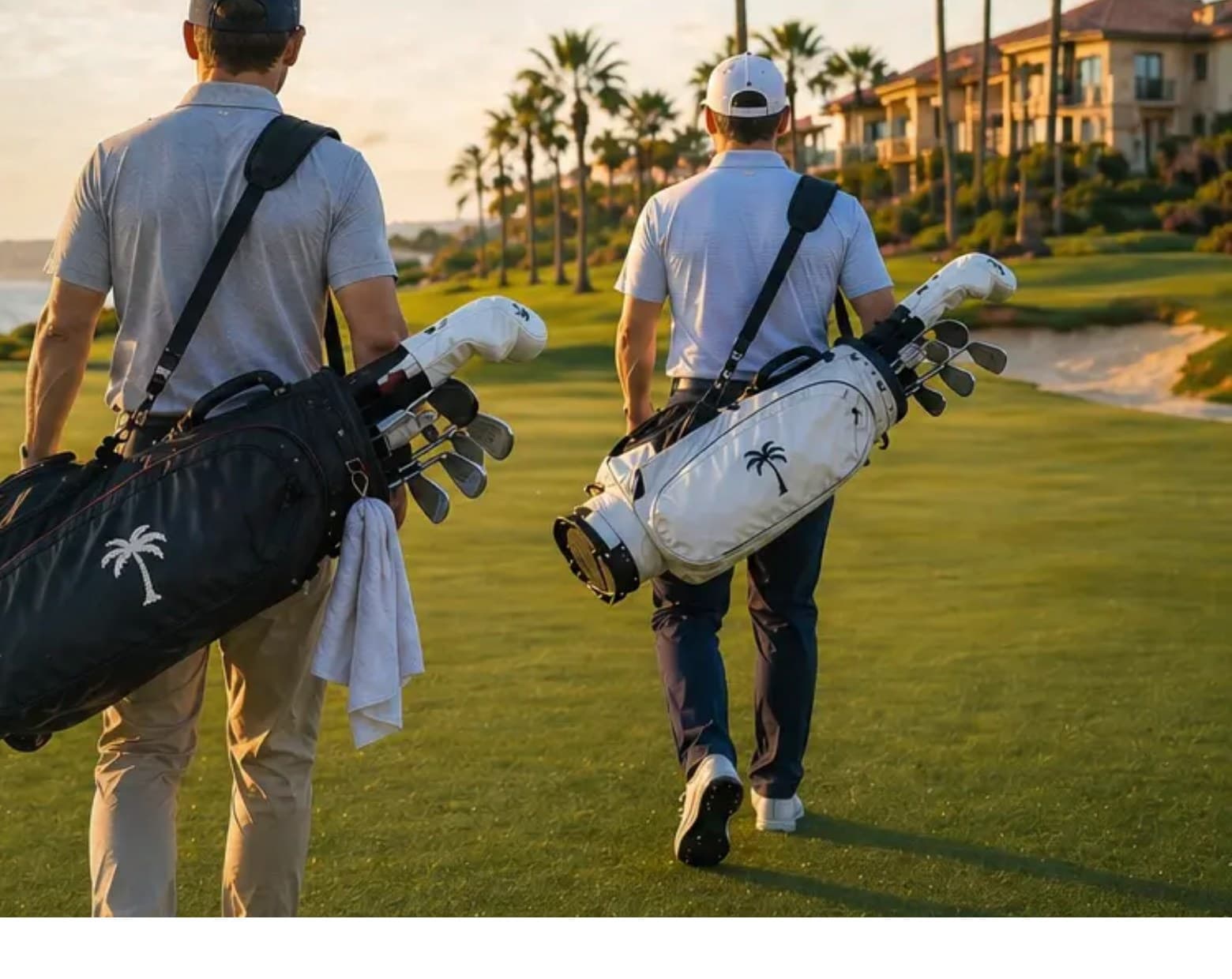
A deep clubhouse green and warm gold palette, paired with a heavy display serif, sets the tone before a word is read. The hero is full-bleed course photography at golden hour with the quote widget sitting directly on it, so the first thing a visitor sees is both the promise and the way to act on it.
From the Fairway Freight website
Design
Design direction
- Palette
- Clubhouse green, warm gold, off-white
- Display type
- Heavy contrast serif for headlines
- Text type
- Humanist sans for interface and reading
- Imagery
- Full-bleed course photography, golden hour
A deep clubhouse green and warm gold palette, paired with a heavy display serif, sets the tone before a word is read. The hero is full-bleed course photography at golden hour with the quote widget sitting directly on it, so the first thing a visitor sees is both the promise and the way to act on it.
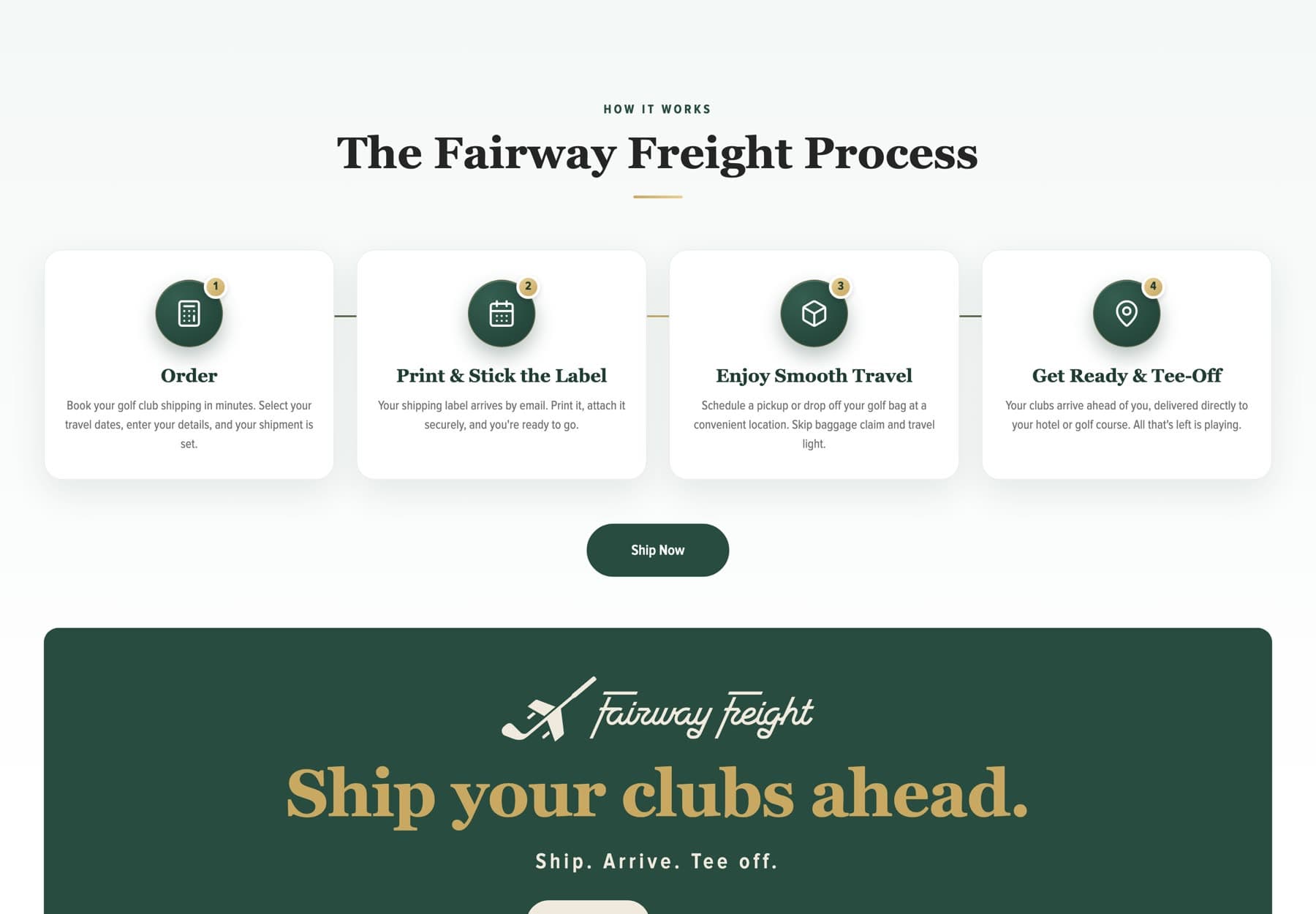
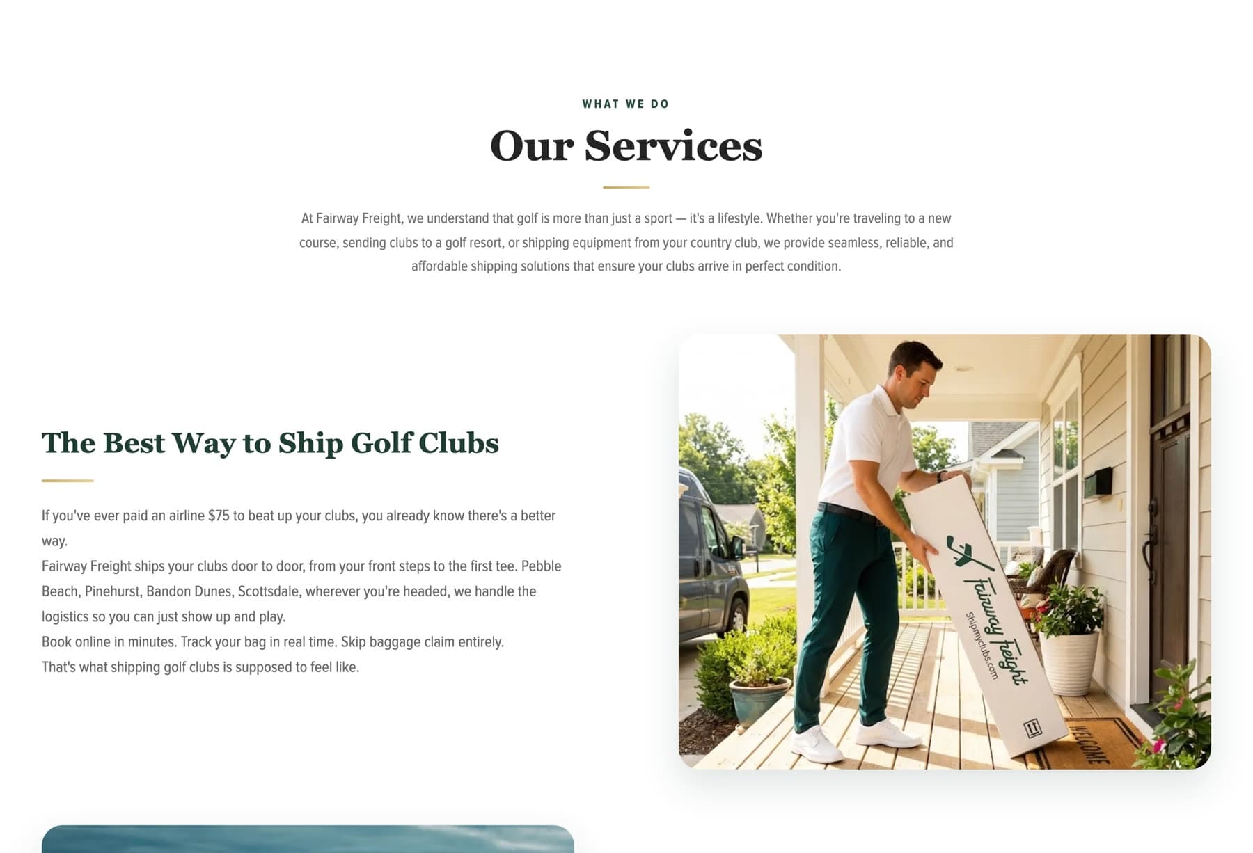
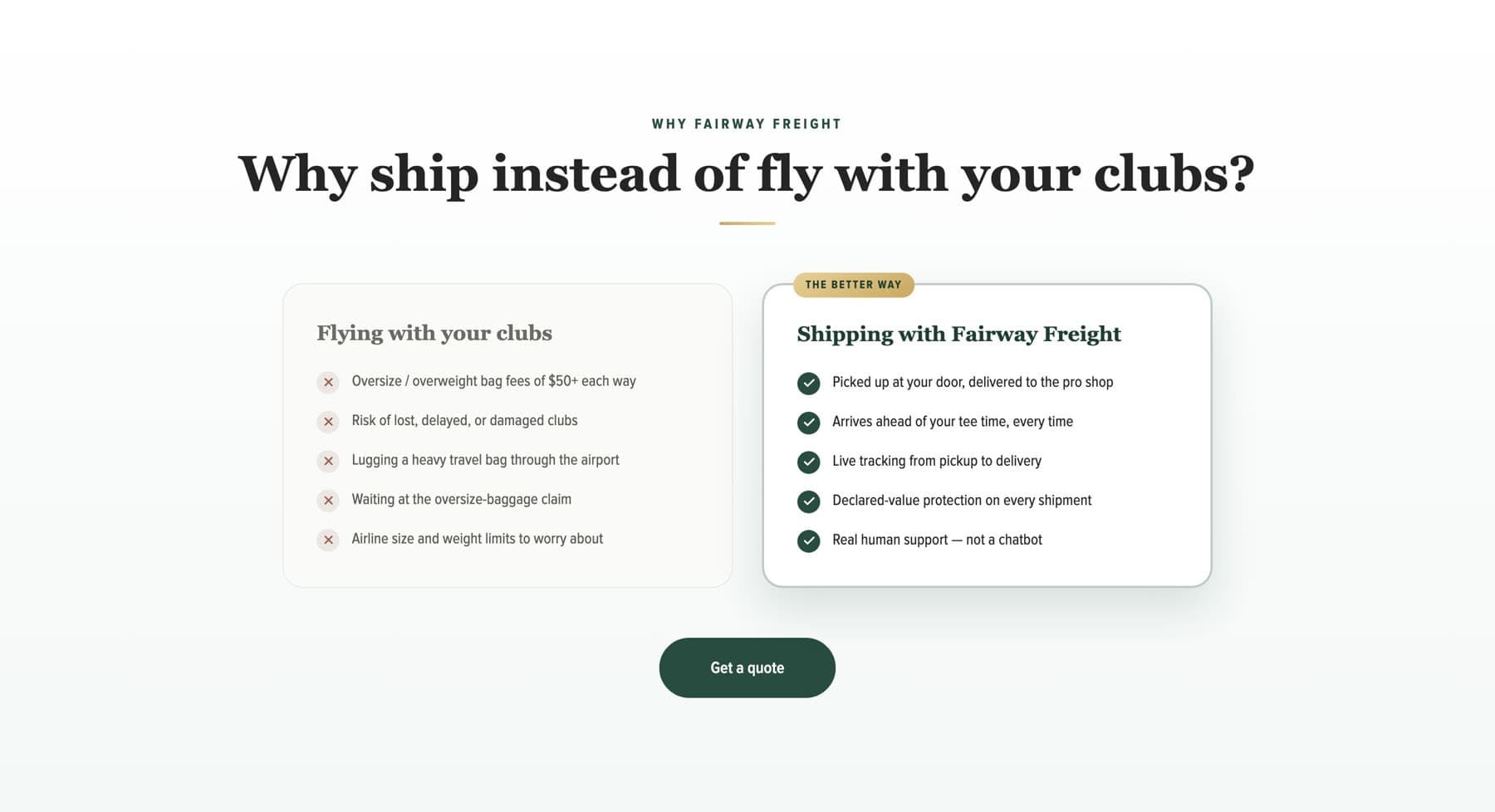
The rest of the page alternates between photographic sections and quiet, near-white ones. Numbered steps, comparison blocks, and destination panels all reuse the same spacing and rule weights so the site reads as one piece rather than a stack of modules.
Interface elements (the one-way and round-trip toggle, the address fields, the trust markers) were designed to feel like part of the brand rather than a form dropped into it.
Content
Content hierarchy
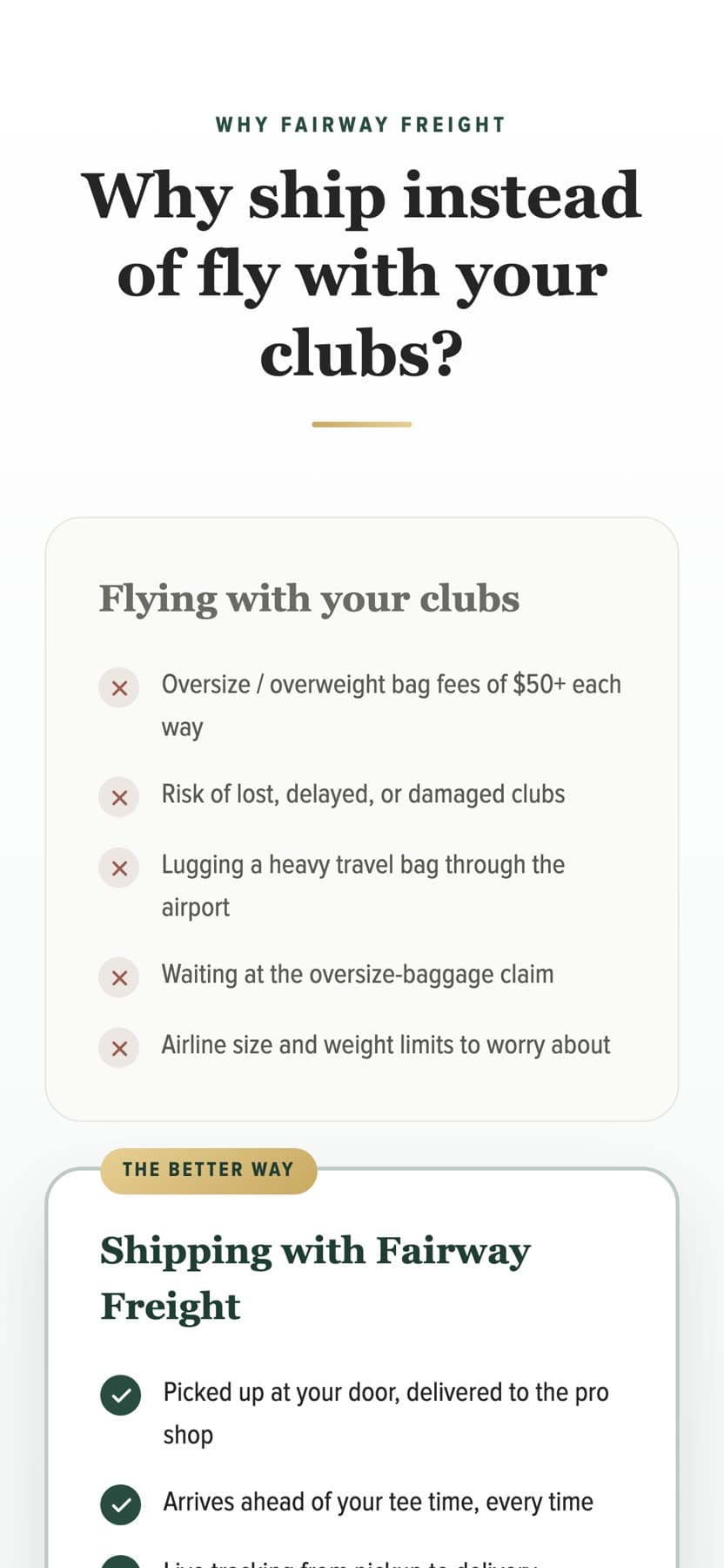
The page opens with the offer and the booking widget, then answers the objection immediately after: what flying with clubs actually costs in fees, time, and risk.
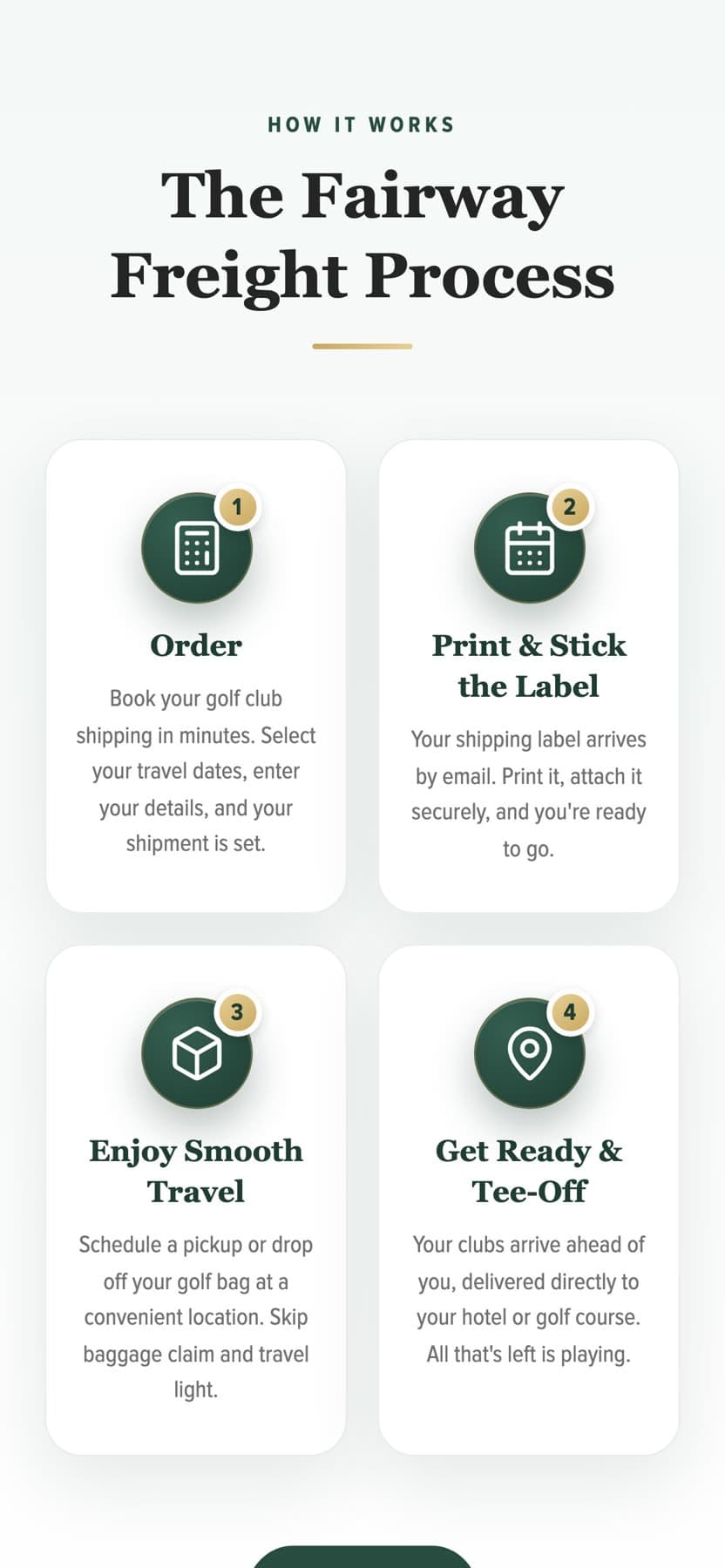
The four-step process is stated twice at different depths (once as a quick scan near the top, once in fuller form further down) so a visitor who is already convinced can book, and one who needs detail can keep reading.
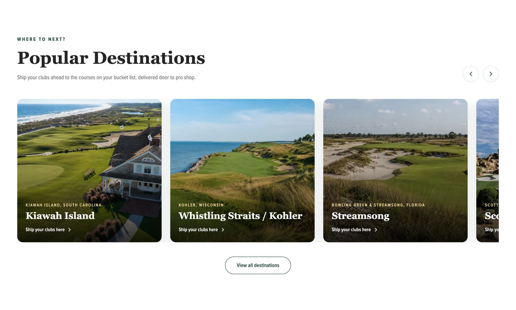
Destination pages carry their own written content for each course and resort, which is what makes them worth having. Help, tracking, and account pages sit behind a clear utility layer rather than competing with the marketing flow.
- 01Offer and instant quote: pickup, delivery, and trust markers
- 02How it works: four steps, book to tee off
- 03Services: what shipping with the company covers
- 04Fly versus ship: a direct, honest comparison
- 05Destinations: dedicated content per course and resort
- 06Help, tracking, and account: utility without clutter
Mobile
Mobile experience
Golfers book from phones, often while planning a trip in a group chat. The quote widget is the first interactive element on mobile, sized for thumbs, with the address fields stacked and the trip-type toggle full width.
The display serif re-sets smaller so the headline still lands in two lines. Photographic sections crop to keep the subject in frame rather than letterboxing, and the comparison block becomes two stacked panels instead of a side-by-side table.
Tracking and help stay one tap from anywhere on the site.
Gallery
Selected pages.
See it in use.
Screenshots on this page were captured from the live website. The site itself is the best version of the work.
Want work like this for your business?
Every project starts with a conversation about what the business does and who it is trying to reach.